Redefining an evolving agency identity.
The Development
The Pharm, an agency exclusively collaborating with Boots under the VML umbrella, needed a refreshed logo to reflect its growth and evolution. The original design, created at the agency’s inception, no longer aligned with its current identity or met its business needs.
Inspired by recent industry rebrands, I aimed to create something distinctive—steering away from the ultra-sleek and modern trend. I wanted a logo with character, drawing inspiration from Art Deco and mid-century modern aesthetics. These styles, with their timeless appeal and bold geometry, shaped the visual direction.
When approaching a redesign, I believe in exploring every possibility. My process involves experimenting with numerous ideas, filling (and often overflowing) an Illustrator artboard with concepts. Some designs are highly polished, while others are rough sketches—each contributing to the final direction. You can see a snapshot of my creative exploration below.
Logo options
I presented three logo concepts to my design director as part of a team-wide review, where each team member contributed a unique proposal. My designs aimed to reflect The Pharm’s identity while considering its connection to Boots.
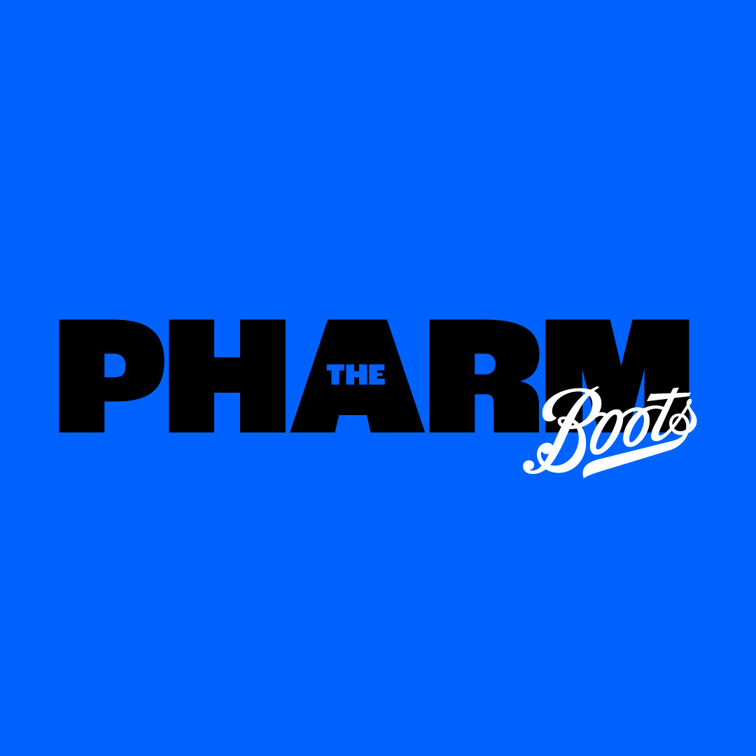
Option 1: A bold and straightforward approach, featuring a thick, modern typeface. The weight and simplicity of the design ensured it could be seamlessly combined with the Boots logo, reinforcing The Pharm’s role as an agency for Boots within VML.
Options 2 and 3: These concepts were more decorative and stylized, diverging from the original logo’s look. They explored fresh, unexpected directions, offering creative flexibility and inviting the team to rethink how the agency could present itself.
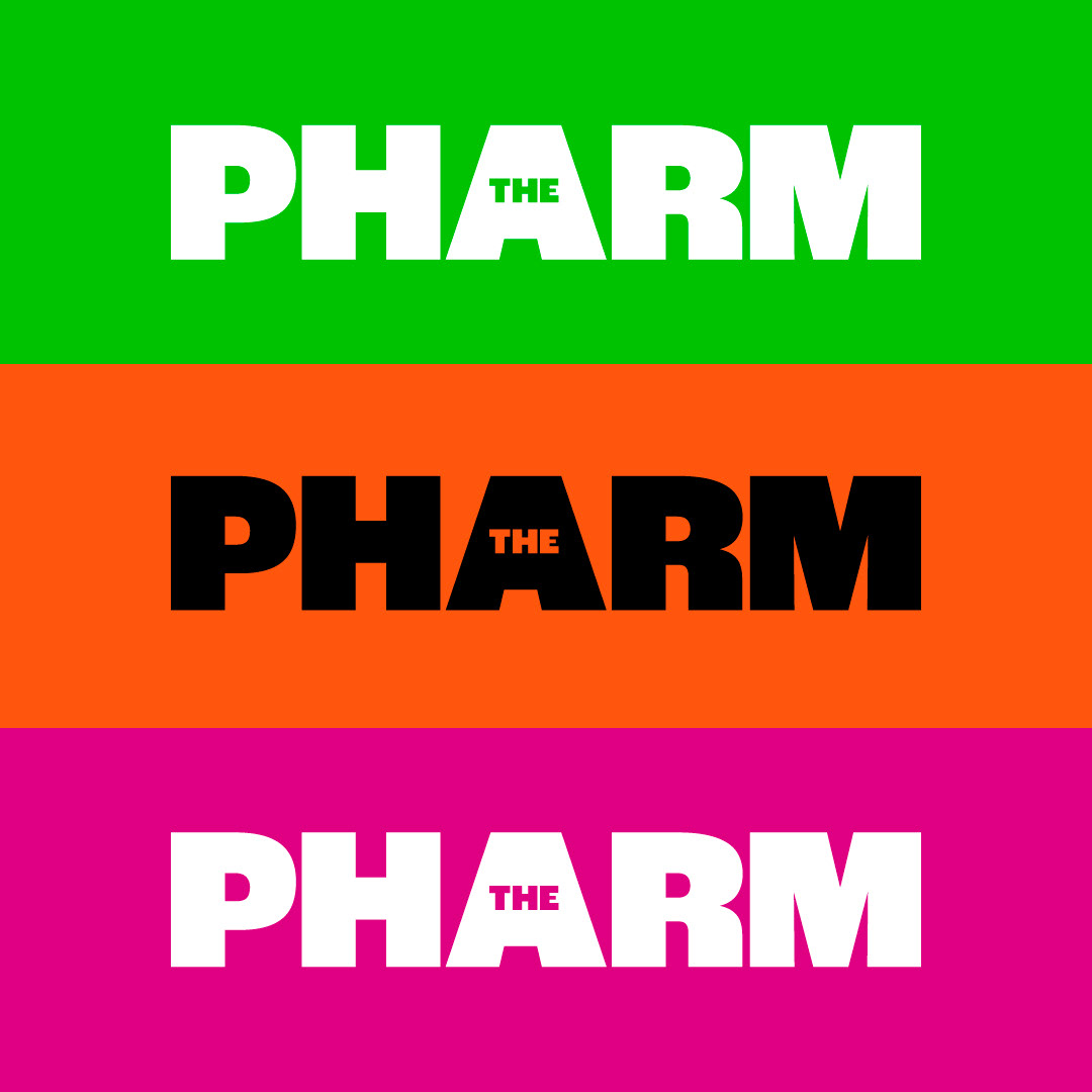
For the colour palette, I chose bold, contrasting tones designed to stand out when showcased alongside other agency work. At the same time, I ensured they maintained consistency with the visual language already established within the business.
Ultimately, Option 1 was selected as the final design. It struck the perfect balance—distinct from The Pharm’s original logo and the other team submissions—while fitting seamlessly with the agency’s evolving identity and partnership with Boots.
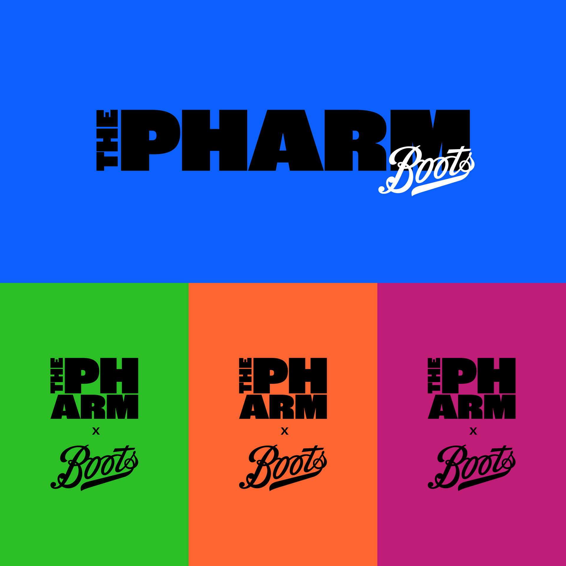
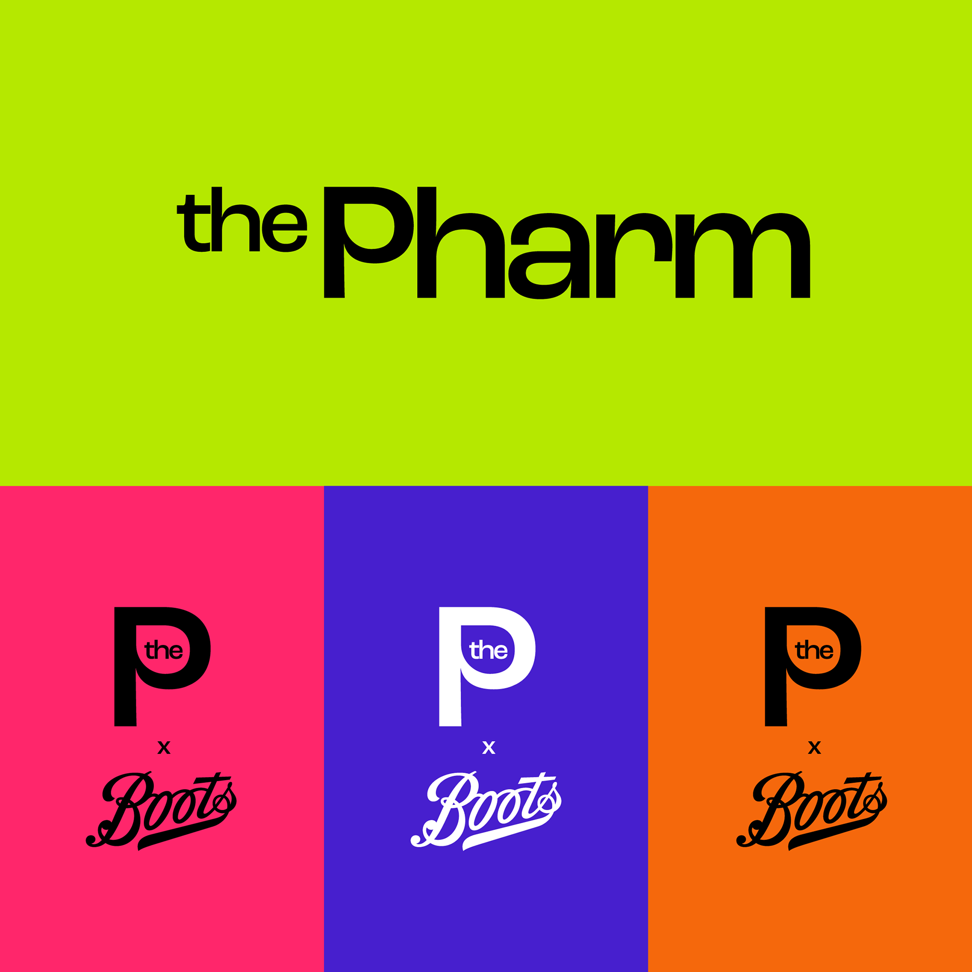
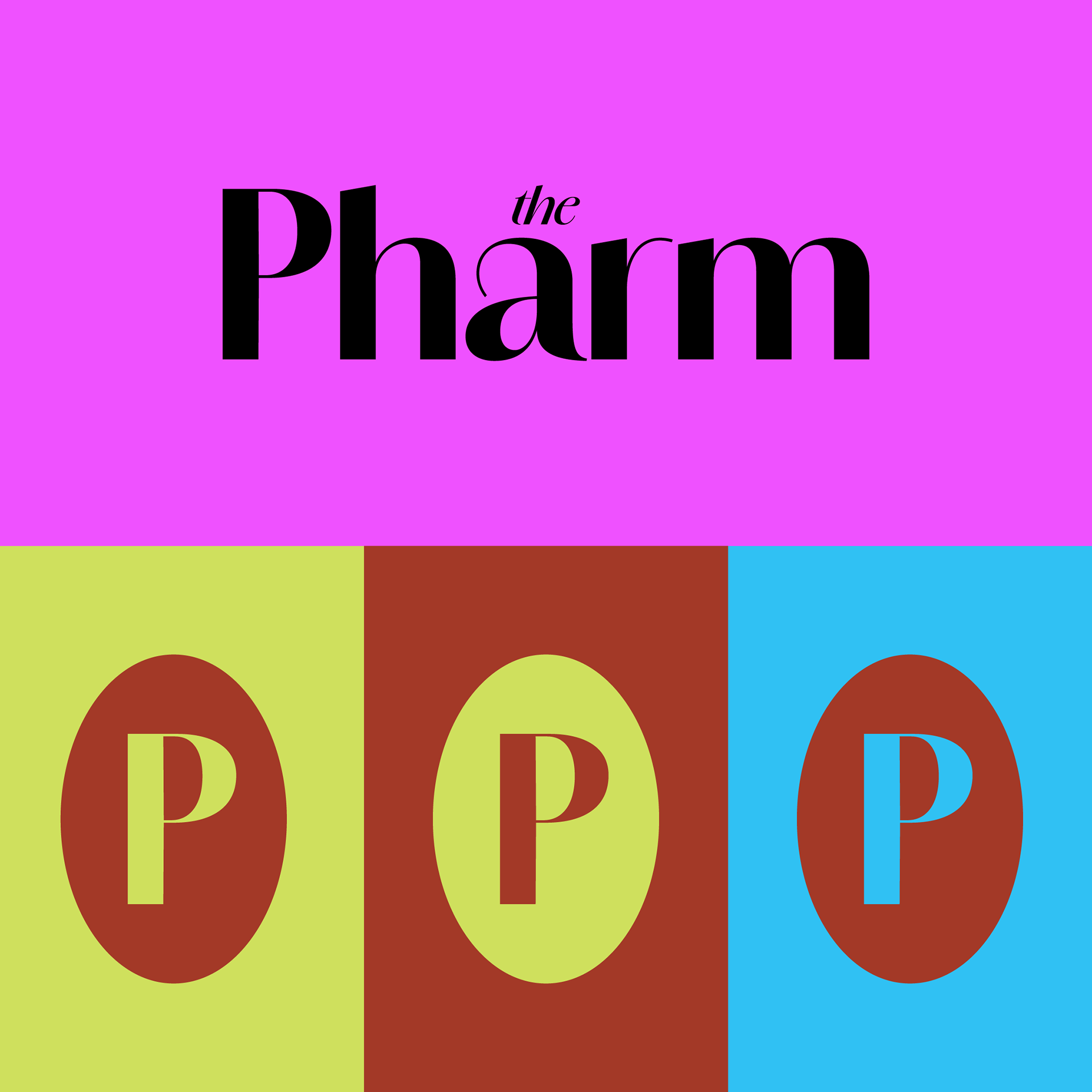
The final Logo option presented
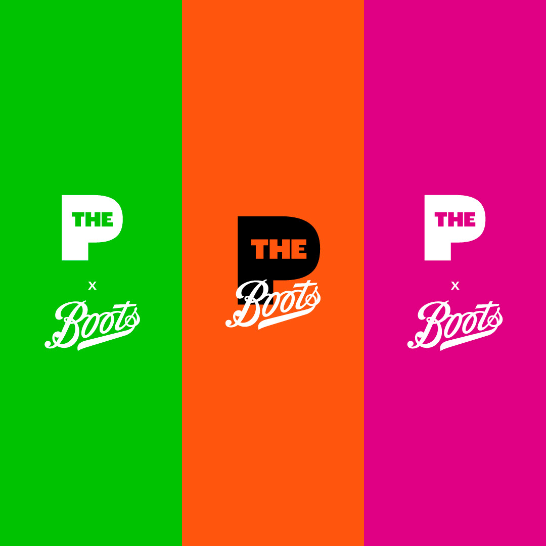
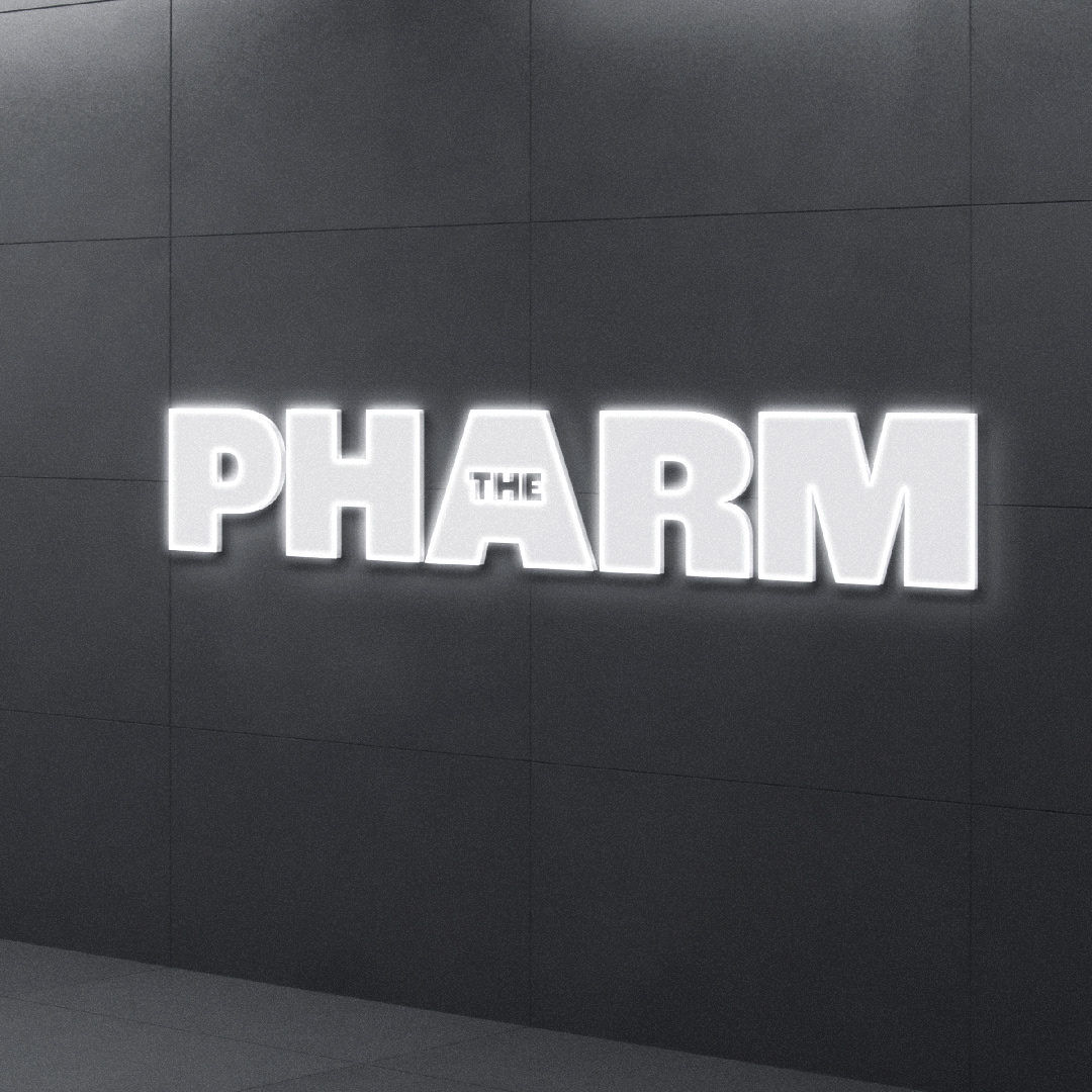
The final logo option successfully reimagined The Pharm’s identity while honouring its close connection to Boots. The bold typeface, paired with Boots’ signature script logo, created a seamless and cohesive design that emphasized The Pharm’s exclusive role within the VML network. Its simplicity and adaptability allowed it to work across a range of applications, from print to digital, while remaining professional and approachable.
The colour palette was chosen for its bold and contrasting tones, ensuring the logo stood out against competitors and other agency materials. This not only made it eye-catching but also maintained consistency with the visual language already established in the business. By balancing contemporary design with a hint of classic branding, this logo perfectly captured the essence of The Pharm’s evolving identity.
