
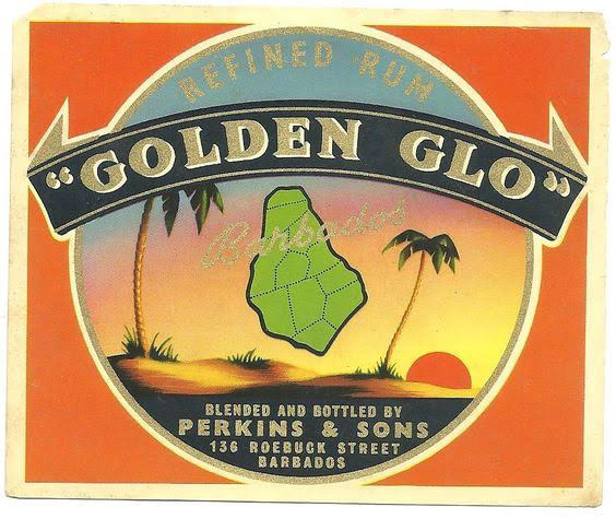
Original Golden Glo Perkins & Sons rum label
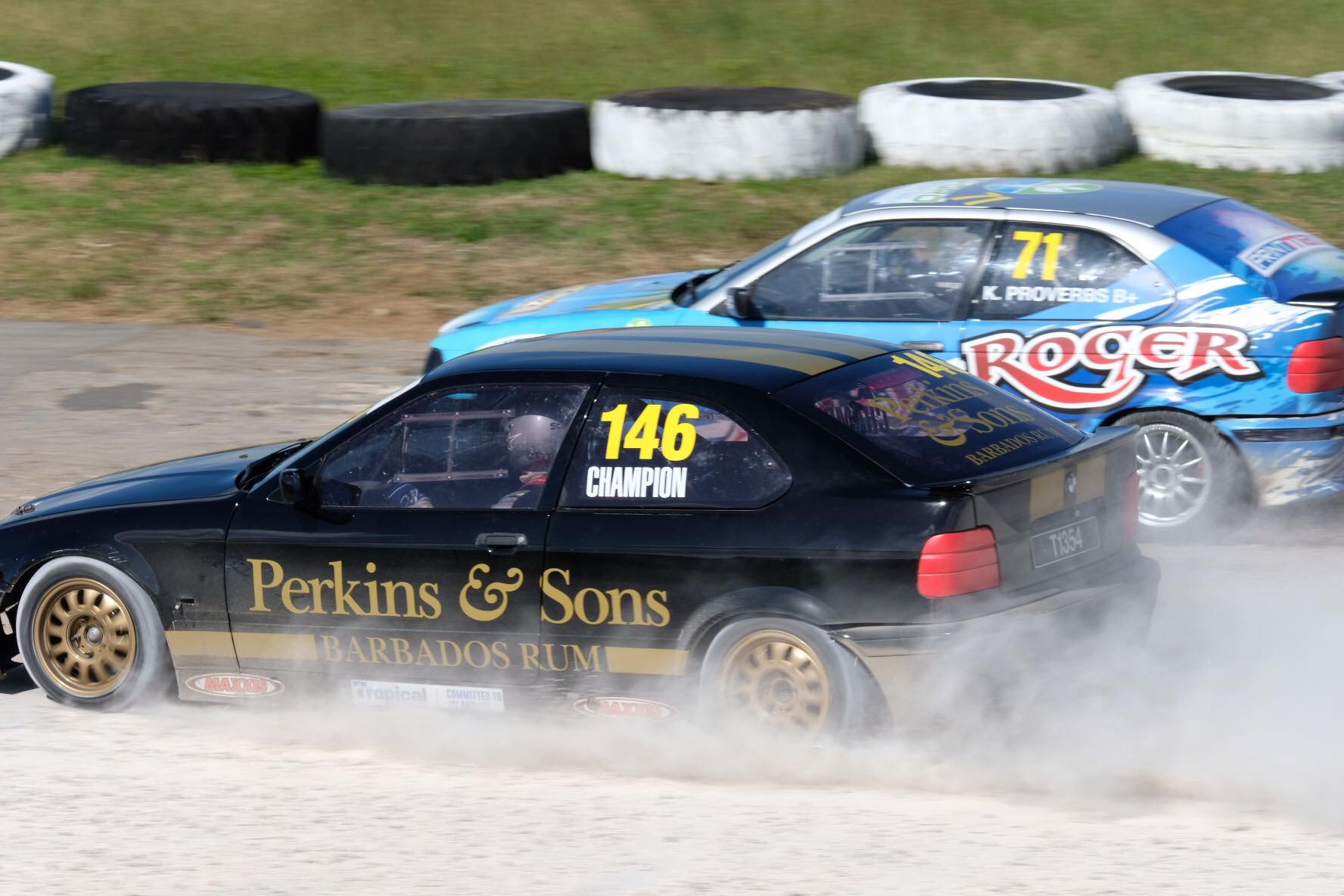
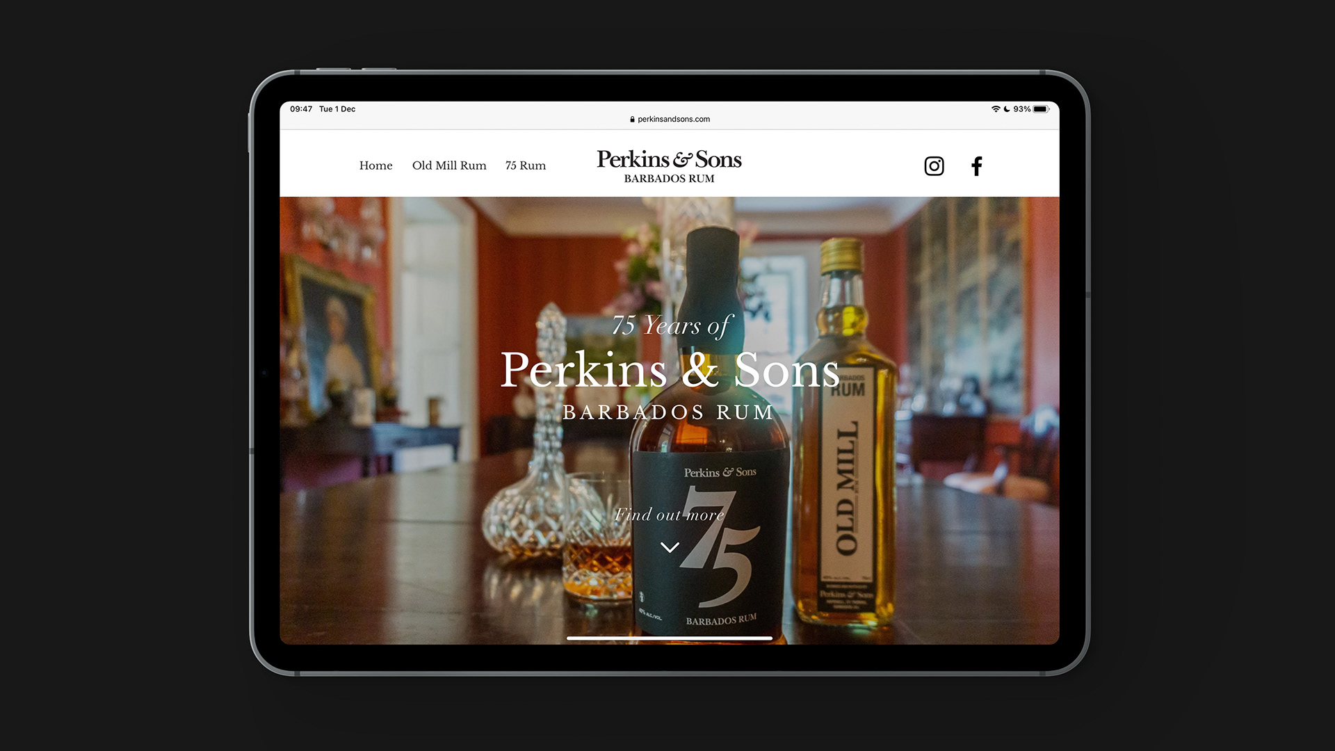
With a legacy spanning over 80 years, Perkins & Sons is a heritage-driven rum brand rooted in the heart of Barbados. As the brand’s Creative Director, Photographer, and Lead Designer, I’ve shaped its visual identity, merging island tradition with modern sophistication. From building the overarching brand world to executing the photography, packaging, and campaign assets, I’ve ensured every design decision reinforces the company’s reputation for craftsmanship and quality.
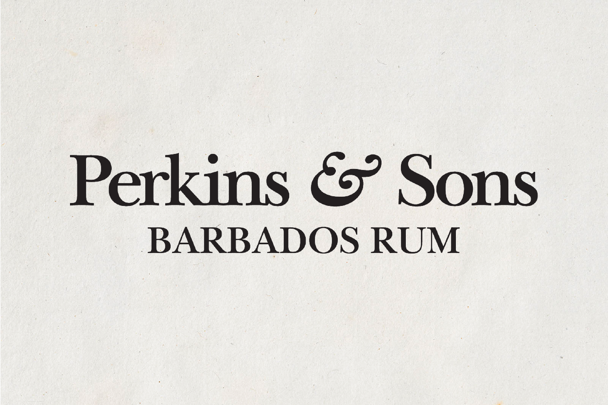

BUILDING A LEGACY: THE PERKINS & SONS LOGO
The Perkins & Sons logo is a contemporary tribute to the brand’s Barbadian roots. I designed it to convey timeless elegance while appealing to today’s premium spirit audience. The carefully chosen typeface and bold detailing offer a visual bridge between heritage and innovation, anchoring the brand as both established and forward-thinking.
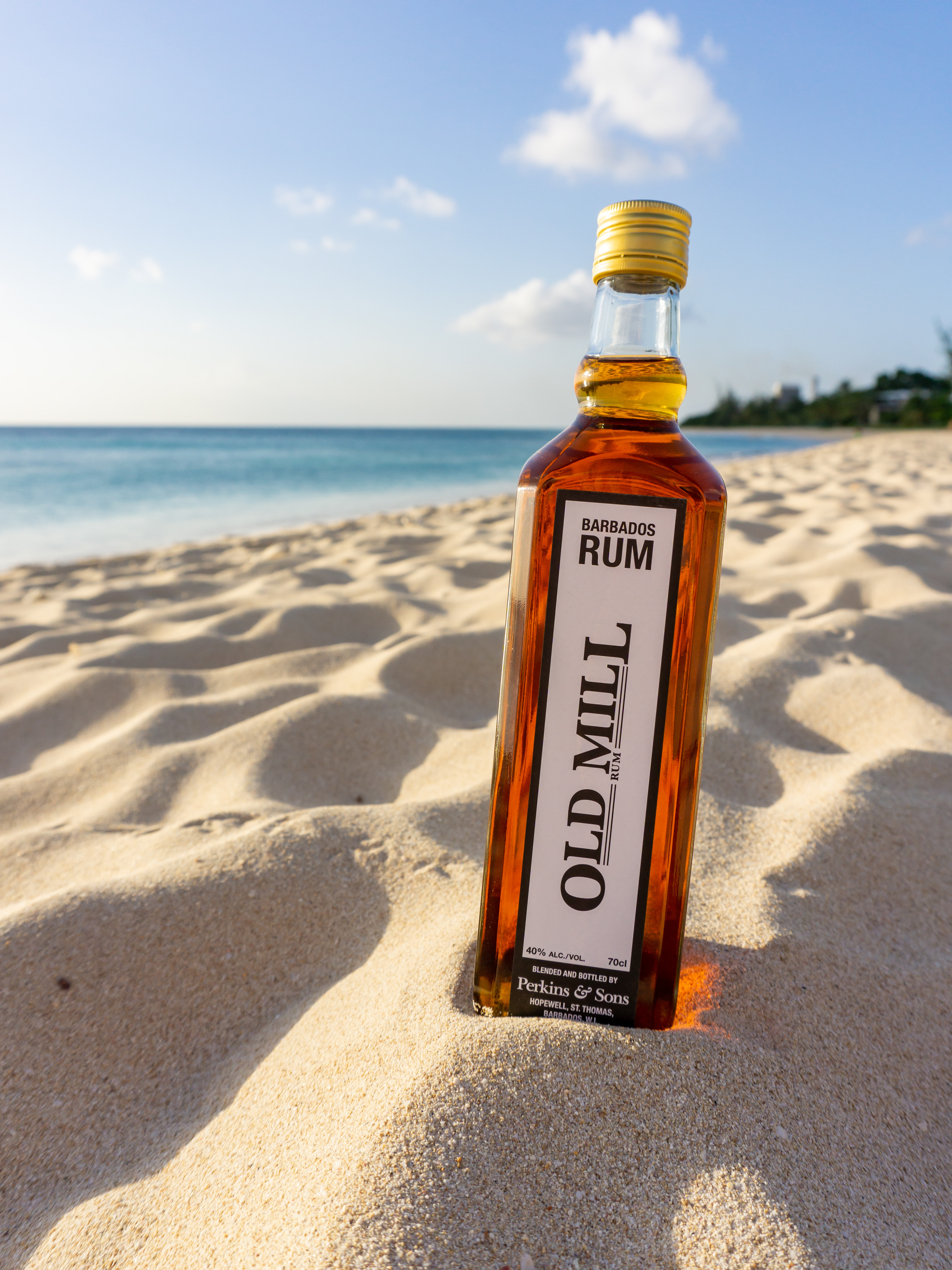
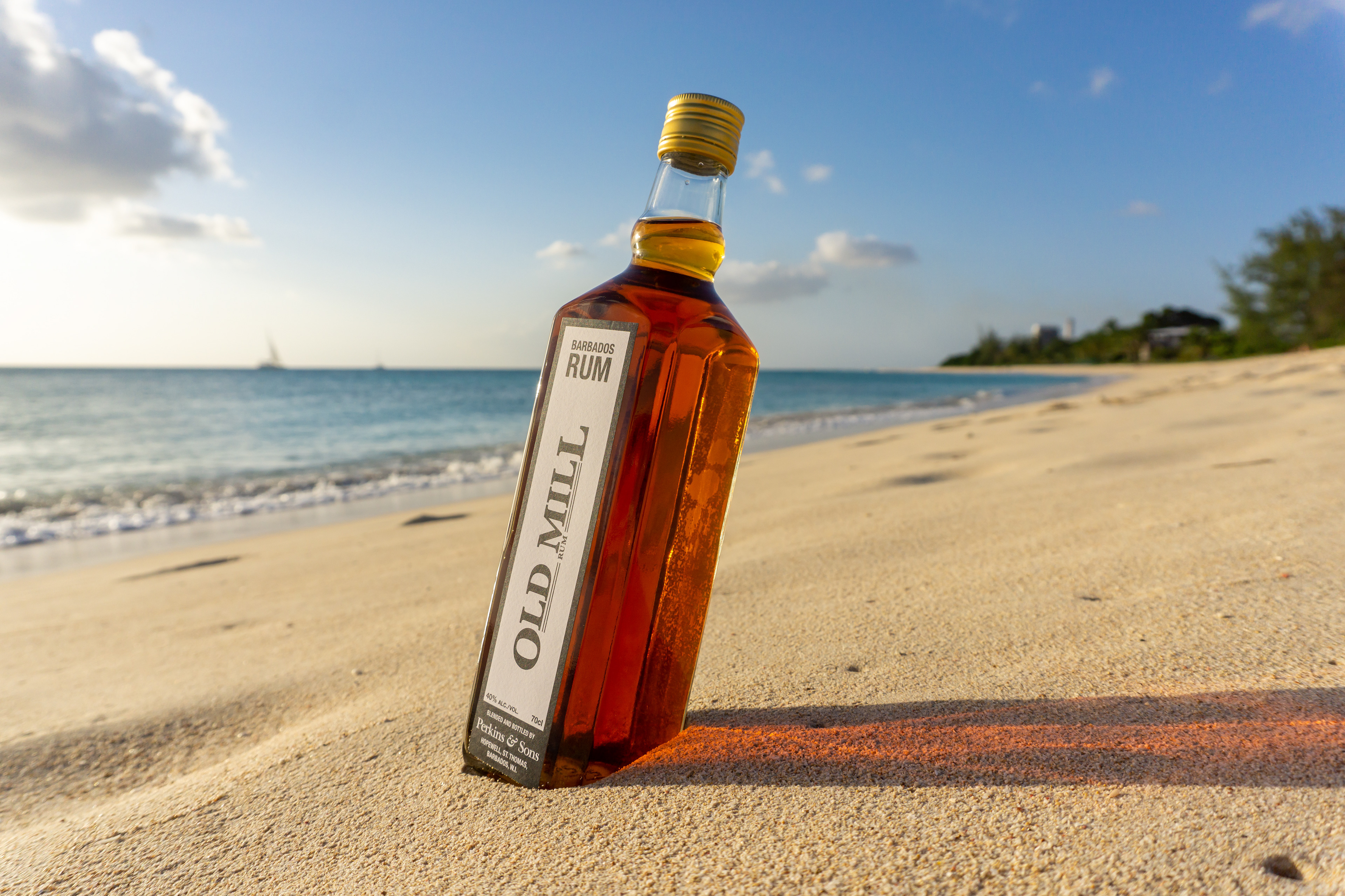
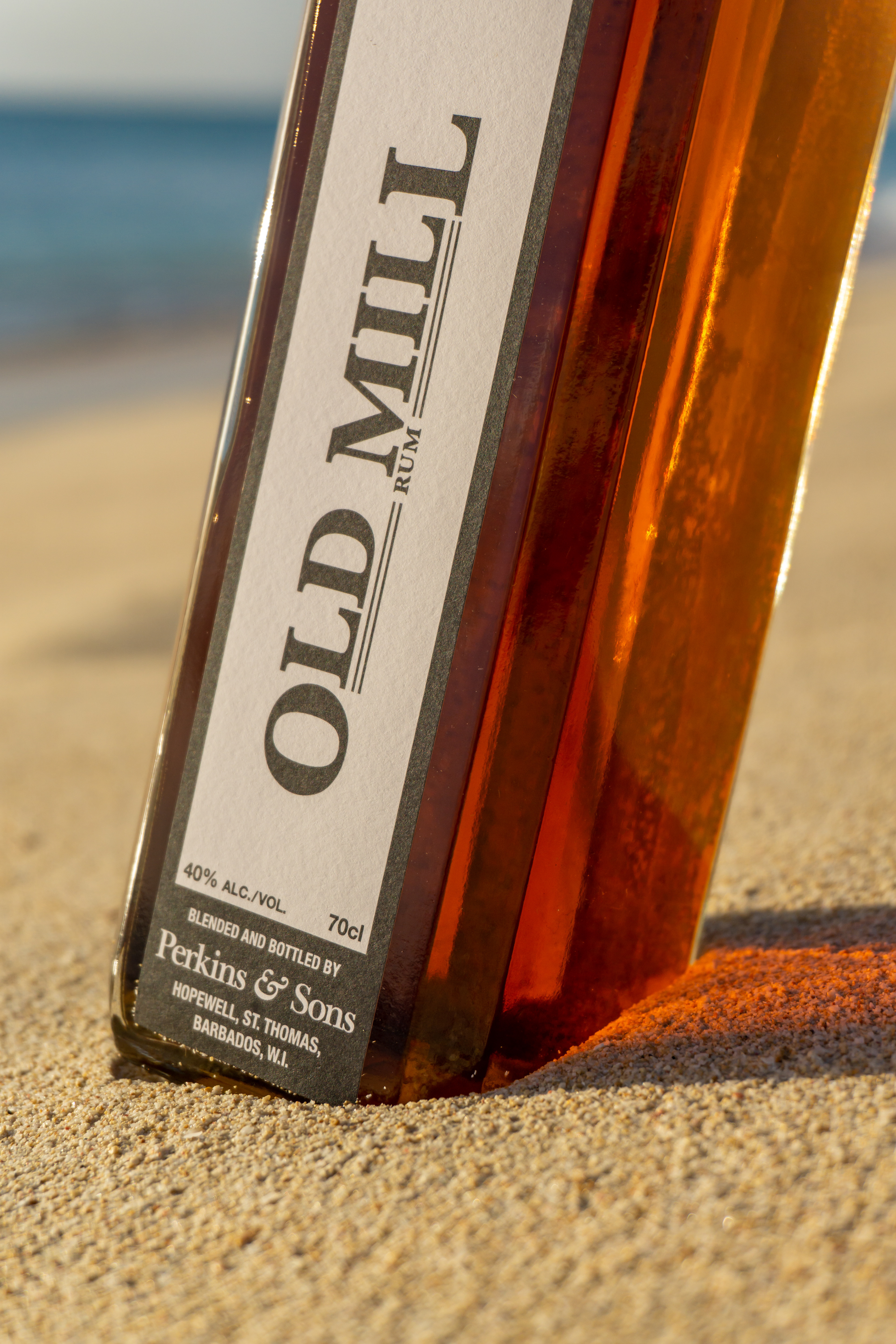
OLD MILL RUM: ICONIC YET CONTEMPORARY
To relaunch Old Mill Rum, I designed a label that reinterprets classic Caribbean rum aesthetics through a modern lens. The pairing of a heritage logo with clean, contemporary typography gives this product a refined presence, appealing to global rum collectors and casual drinkers alike.
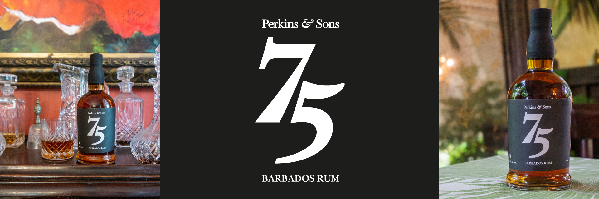
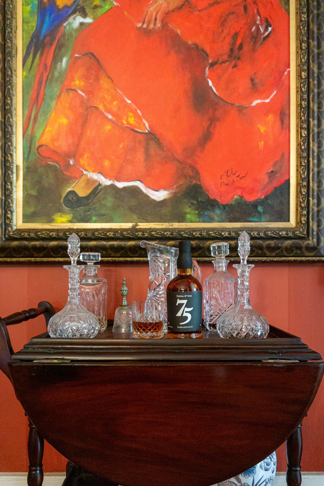
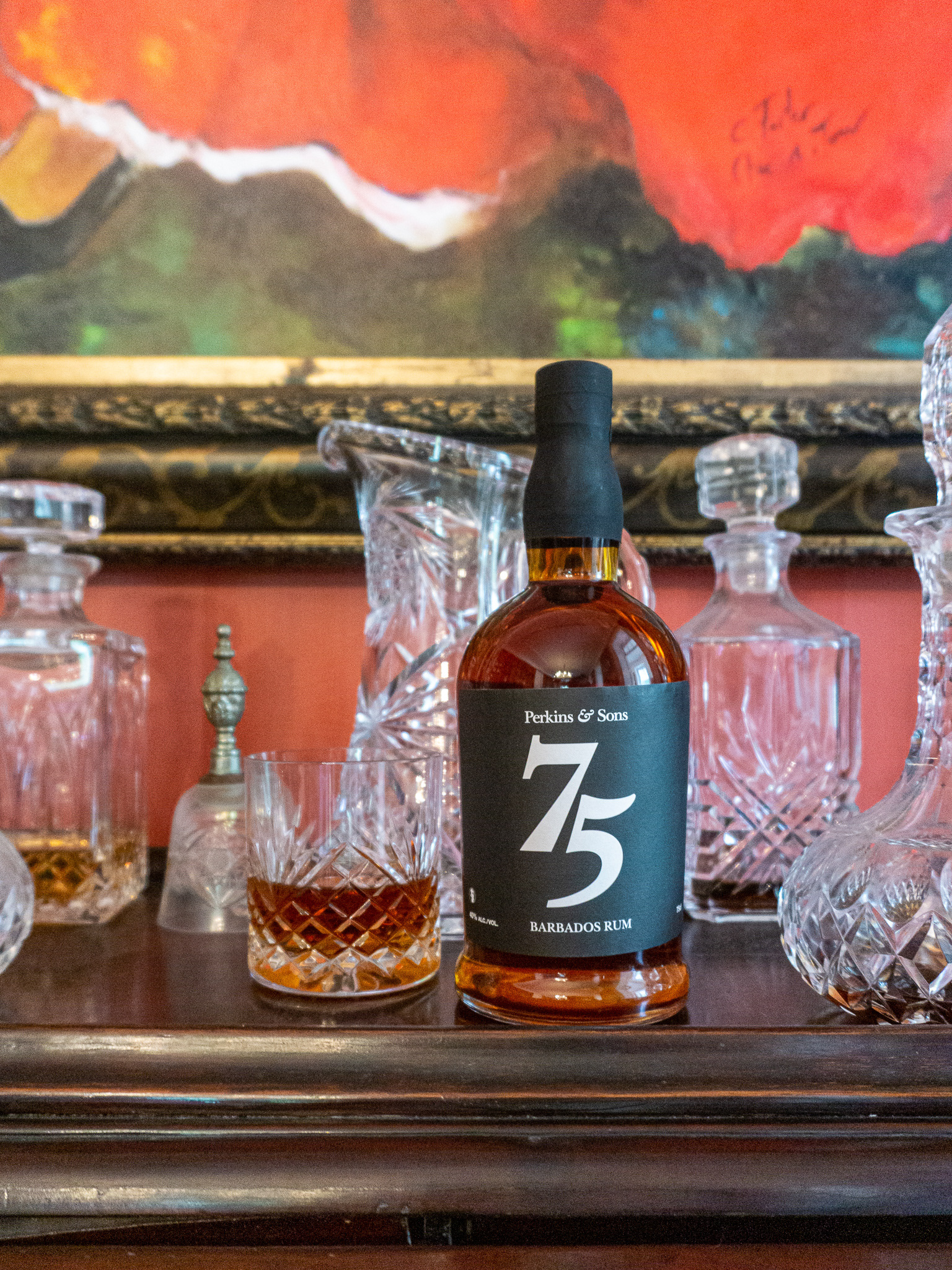
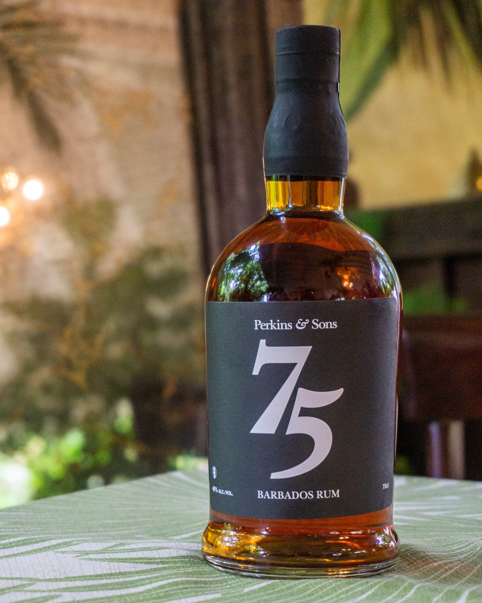
75TH ANNIVERSARY EDITION: TIMELESS DESIGN FOR A MILESTONE RELEASE
For the 75th anniversary release of Perkins & Sons’ 12-Year Rum, I led the concept and design of a premium commemorative label. Featuring a sleek black palette and restrained, elegant typography, the design speaks directly to a mature, discerning audience. I also art directed and photographed the product on location at Lancaster Great House, capturing the spirit’s legacy through visuals used across web, print, and social channels.
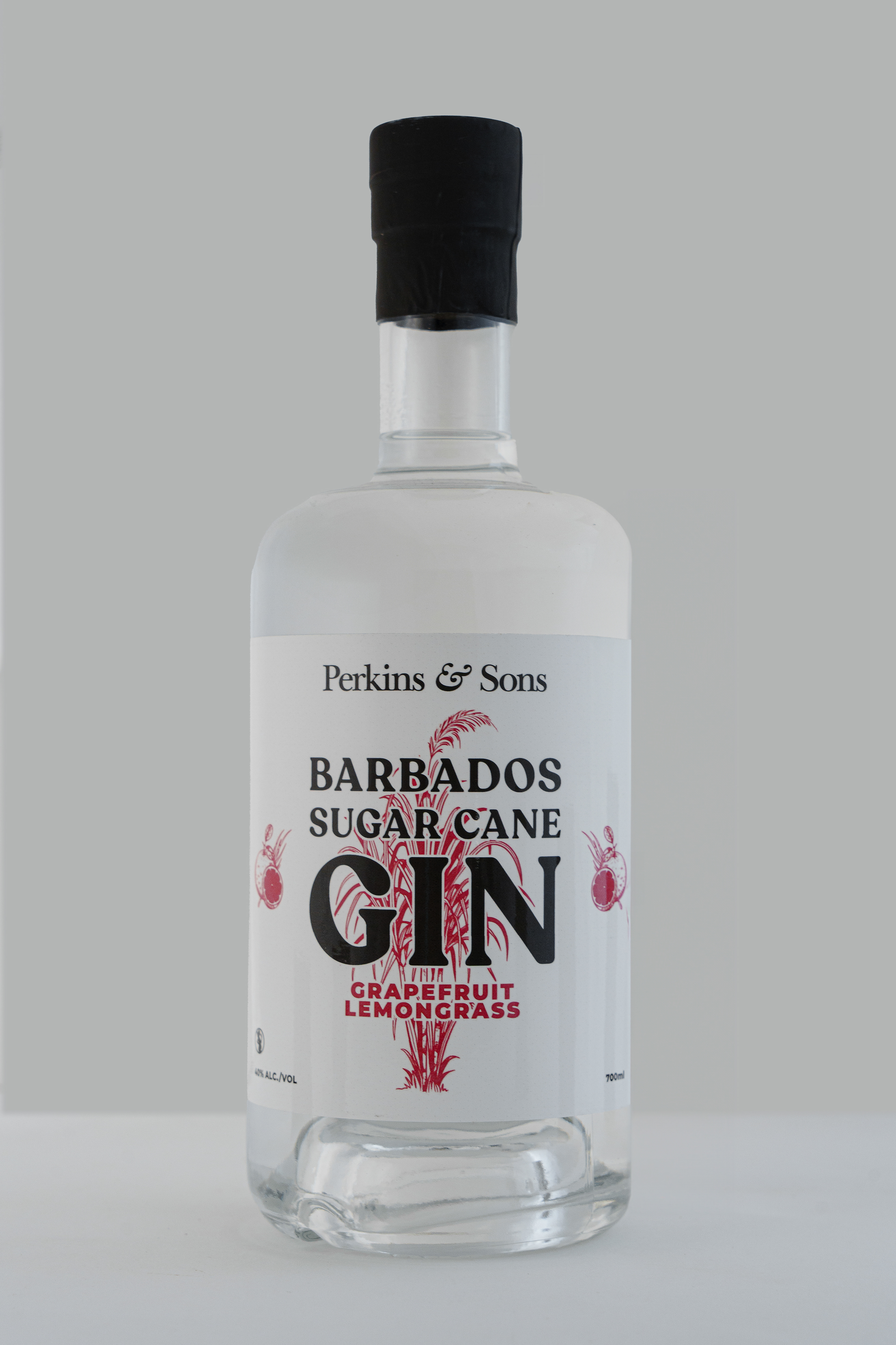
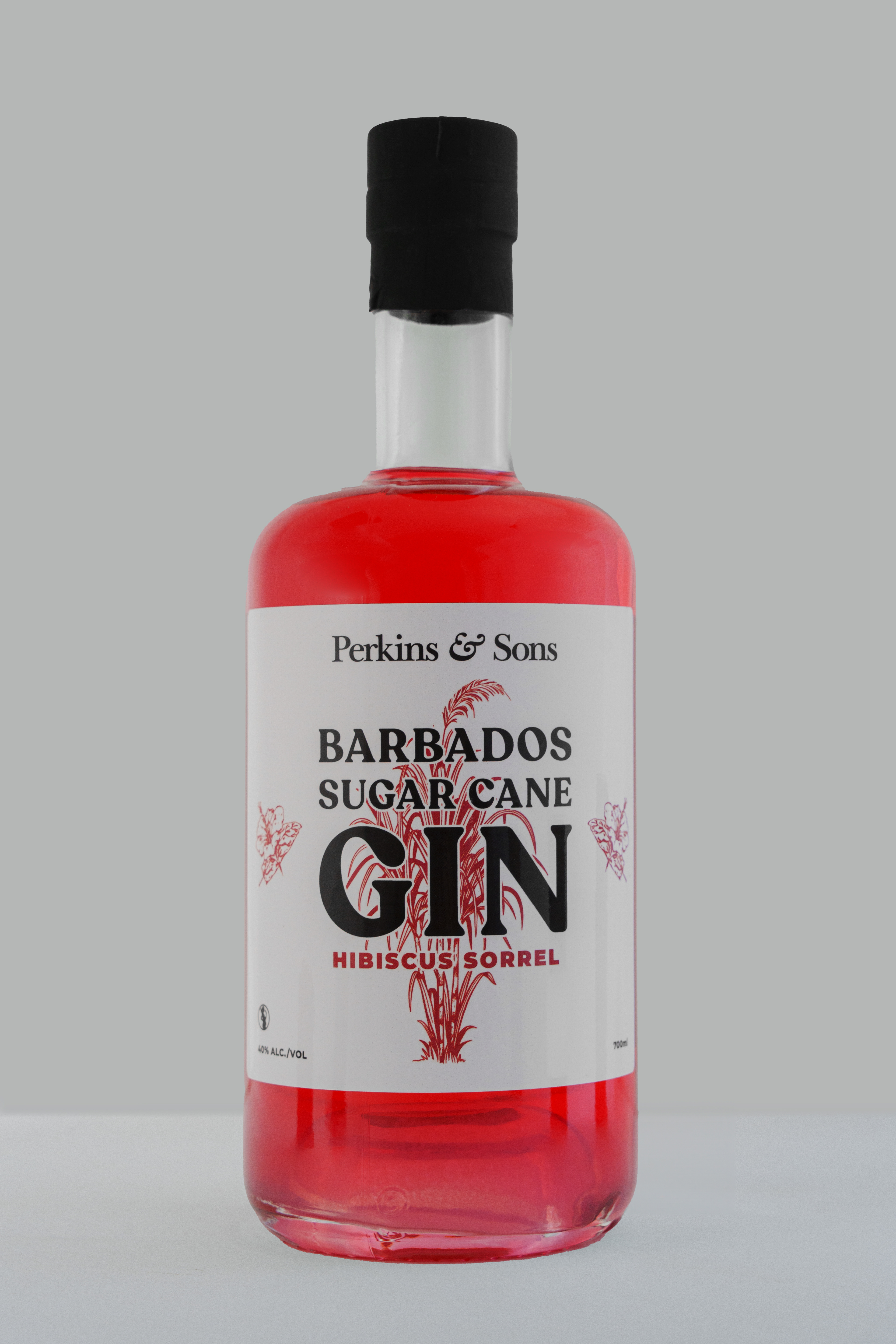
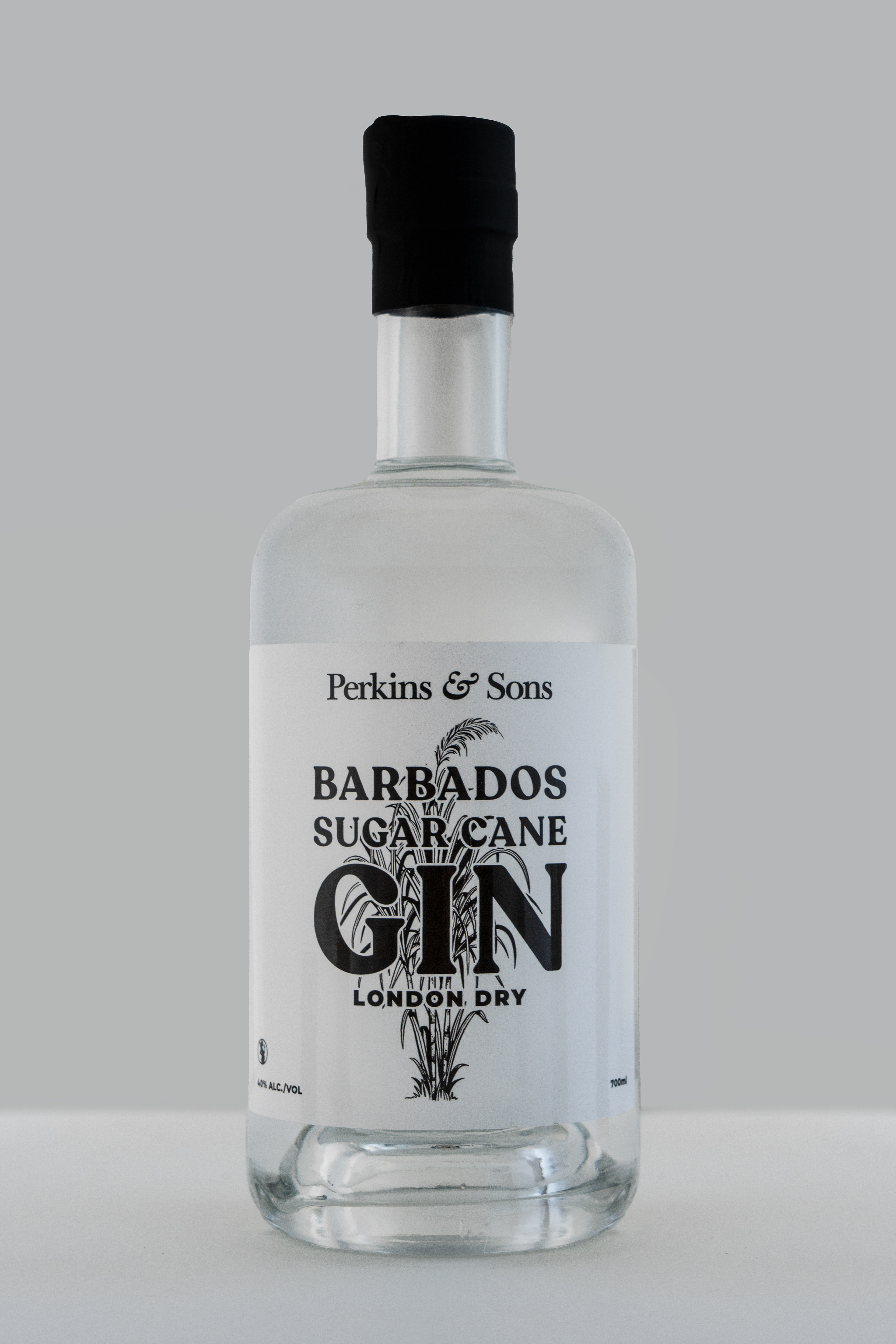
EXPANDING THE RANGE: GIN & VODKA LAUNCHES
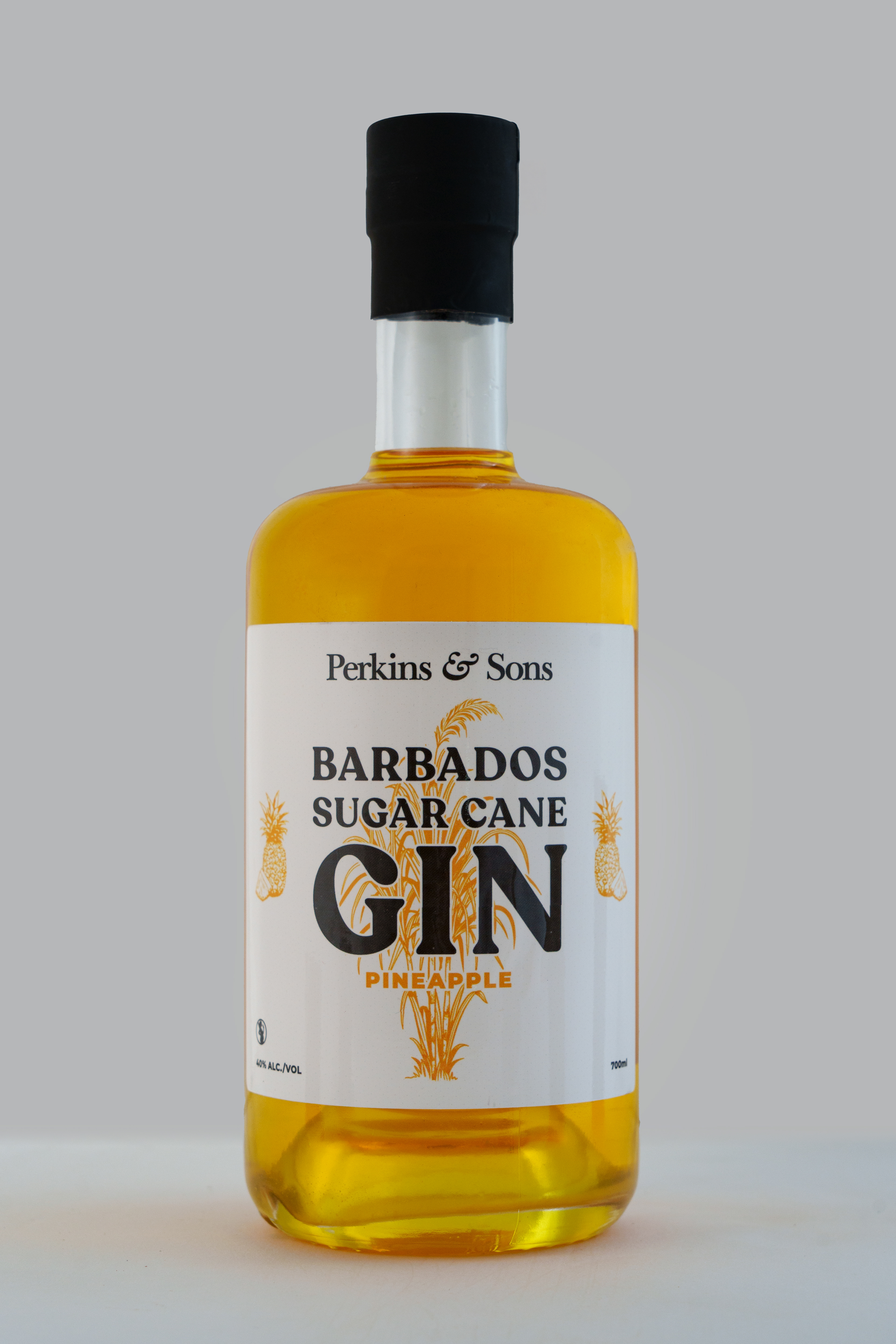
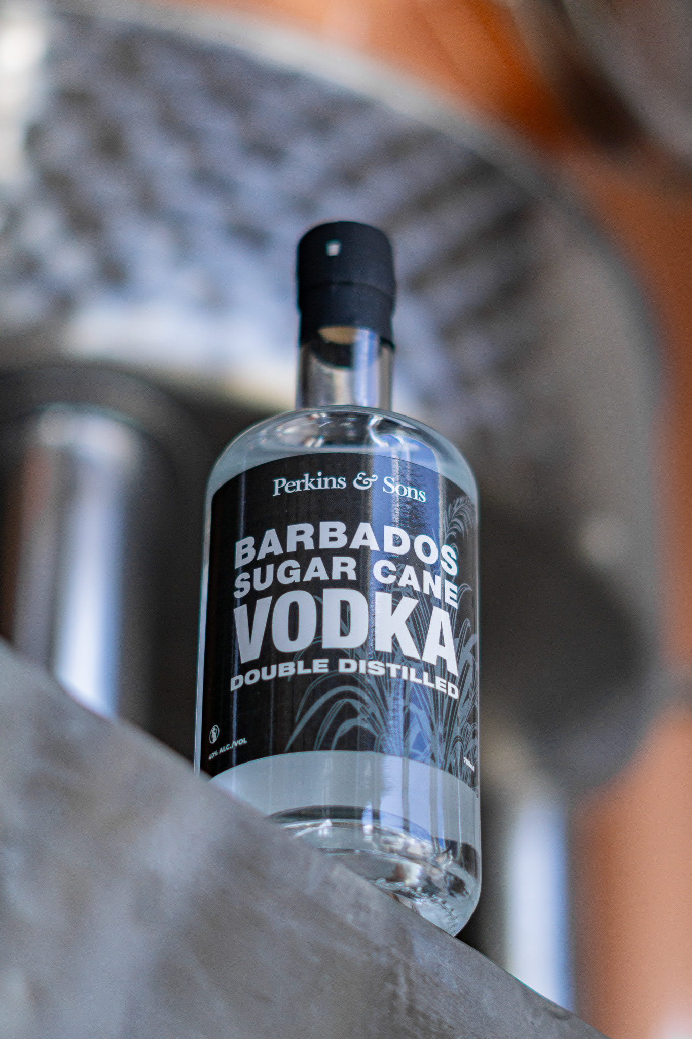
To extend the brand into new categories, I developed the visual identities for Perkins & Sons’ first-ever Sugar Cane Gin and Vodka. Working with Bajan illustrator Nicola Barnard Blades, we crafted original etching-style artwork for the gin, blending island character with premium design. The vodka label took a minimalist approach, with clean lines, bold contrasts, and a sleek black base, to capture the attention of younger, style-conscious consumers while still fitting within the Perkins & Sons aesthetic.
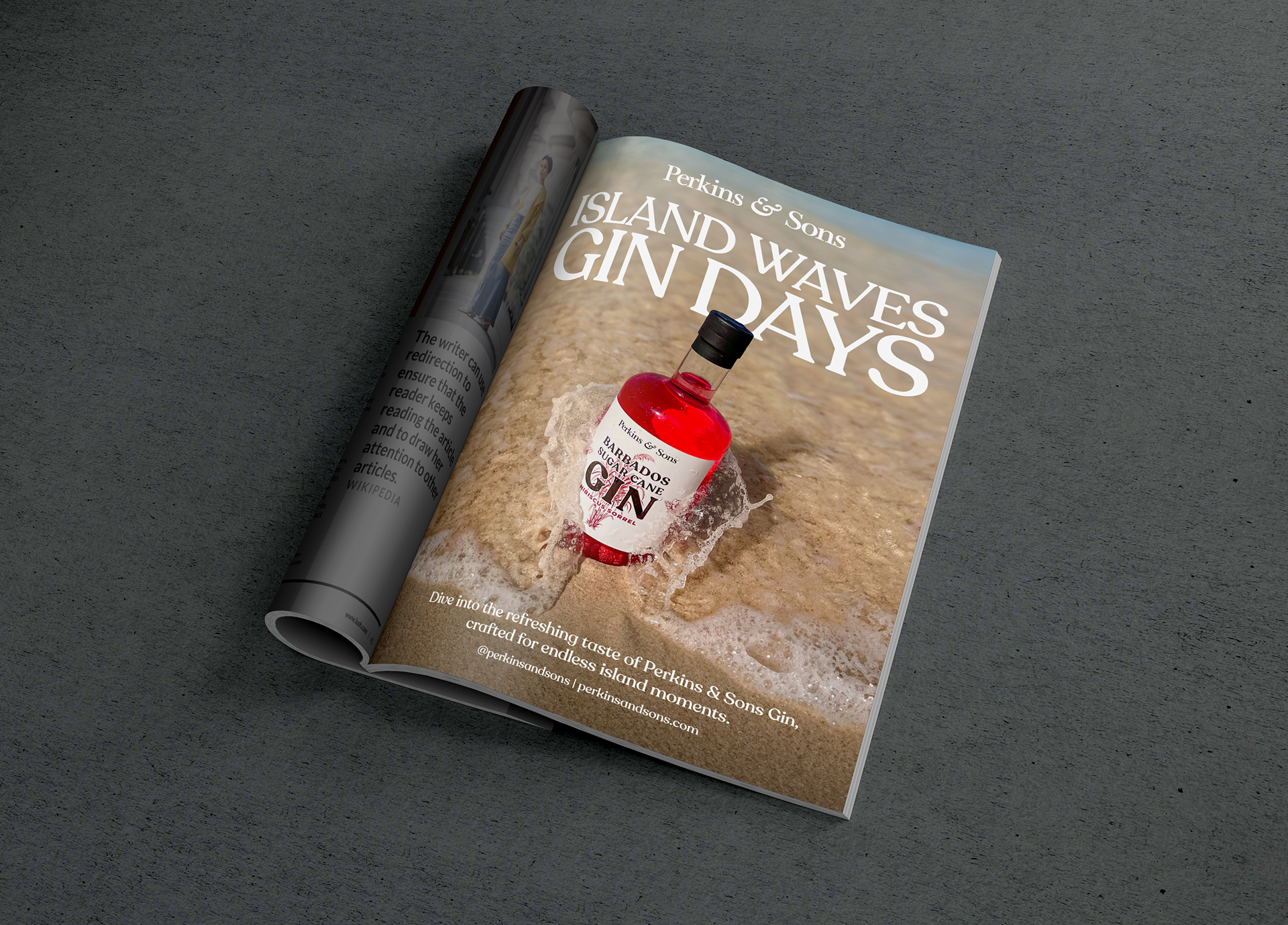
Wine World Christmas 2024 Single Page advert
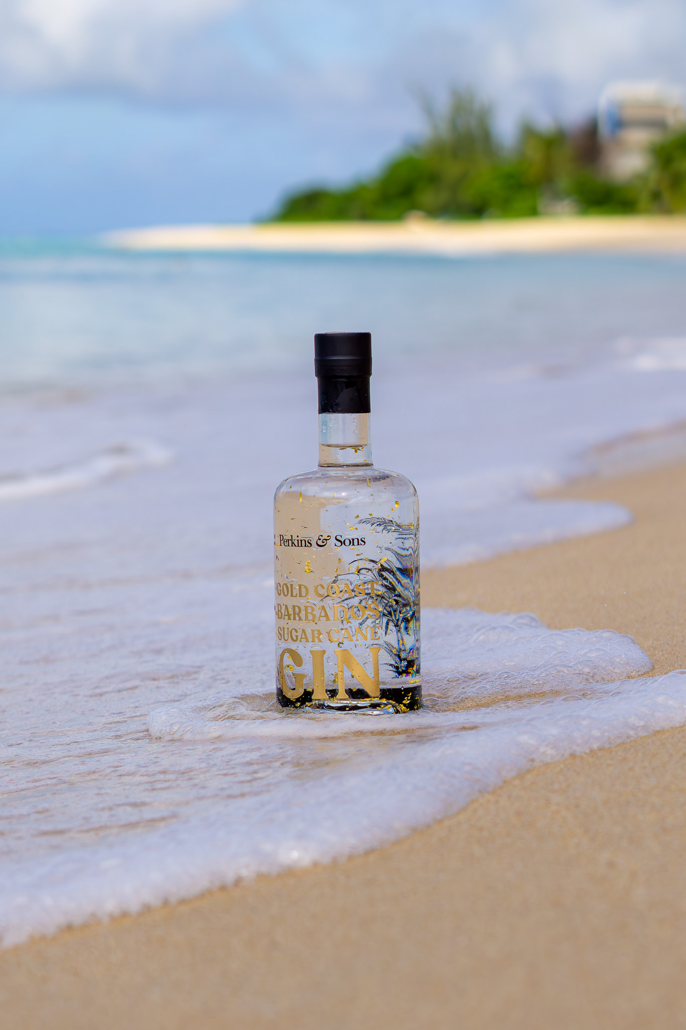
GOLD COAST GIN: DESIGNING FOR LUXURY & LIFESTYLE
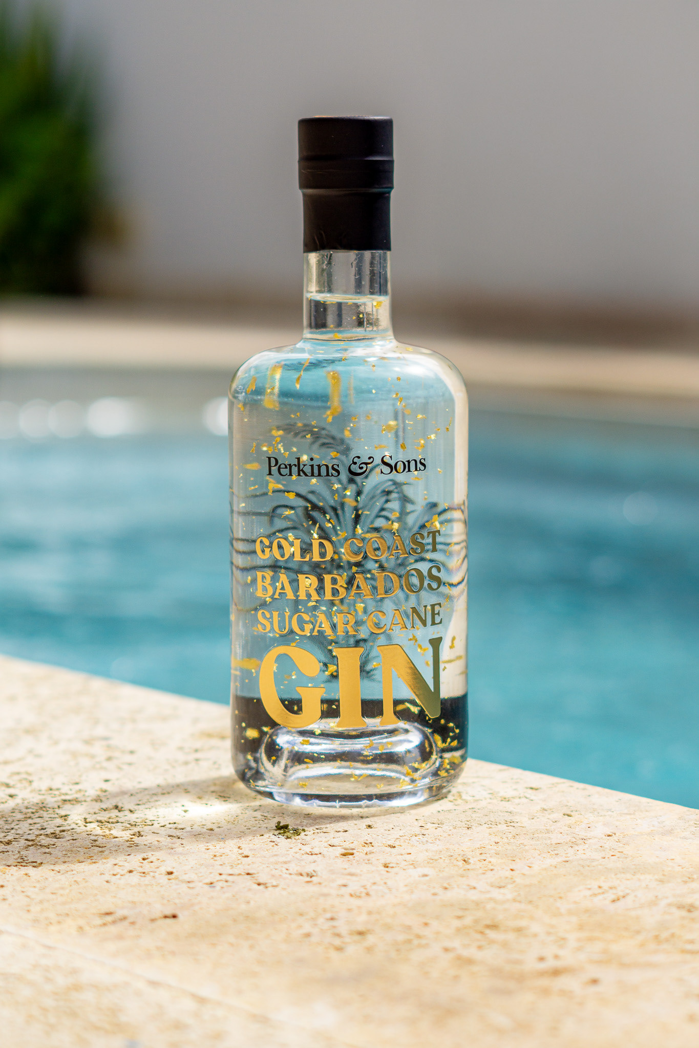
Gold Coast Sugar Cane Gin was created as a celebration of Barbados’ sun-soaked coastline. I developed a luxurious visual identity that shimmered with gold accents, echoing the movement of sand and surf. From bottle design to photography, I captured the gin’s relaxed elegance, turning it into both a conversation piece and a collector’s item.

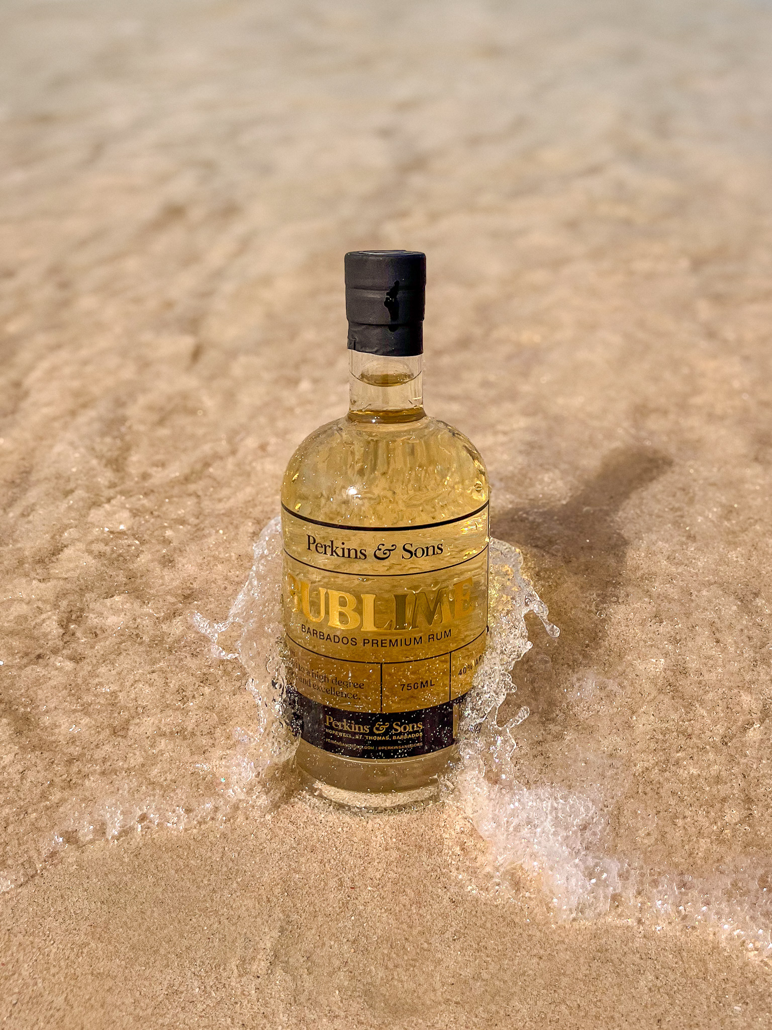
SUBLIME: HONOURING THE ROOTS OF RUM
Sublime White Rum is a return to tradition, crafted in the spirit of Barbados’ earliest rum-making methods. I led the brand and label design, infusing the product with a sense of heritage and prestige. The minimalist label and refined metallic accents reflect Sublime’s purity and craftsmanship, while my art direction and photography reinforced its narrative of artisanal excellence across digital and print.